
Approximately half of all visitors to your website are probably seeing it on a smartphone, even if the distribution of website traffic for individual websites will vary. It’s no longer optional to have a mobile-friendly website. You’ll lose a significant amount of your traffic if the mobile visitors to your site don’t have a positive experience (and hurt your search engine rankings in the process)

Your website must be mobile friendly, which you’ve probably already heard, but we’ll tell it again.
11 Steps to make your website Mobile-friendly
Here are a few actions you can take right away to make sure your website is optimized for mobile users in addition to desktop users.
1. Listen to Your Users
You have to take the time to ask your regular visitors about what they’d like to see on your page in the coming time. Getting input directly from your target audience will help you in discovering missing elements that you might not see on your own. Viewers often know precisely what they don’t like about a website and what change can bring up their interest.

2. Your website should be responsive
The majority of web design professionals concur that developing a responsive website is the best method to make a site that functions effectively on desktop and mobile platforms. That’s because a responsive website has the same information and content on whatever device you visit it, but it adjusts its design to suit the device it’s being presented on.
With responsive design, you can make your website mobile-friendly without restricting the information that mobile users can view — they still have access to all of the same content as your other visitors. Also beneficial to SEO is responsive design.

3. Make Navigation Intuitive
When a visitor lands on your website, they are looking to the navigation bar so that it is easier for them to orient themselves with the page. The navigation bar is very important as it follows the site visitor and throughout their journey on your site will serve as a tool to go back to the landing page for your website.

4. Help People Find the Information They Are Looking For
People frequently bring out their smartphones in order to find something specific, such as an answer to a query, a local restaurant’s address, or a customer support phone number. In these situations, they want to locate the information they require as quickly and easily as feasible.
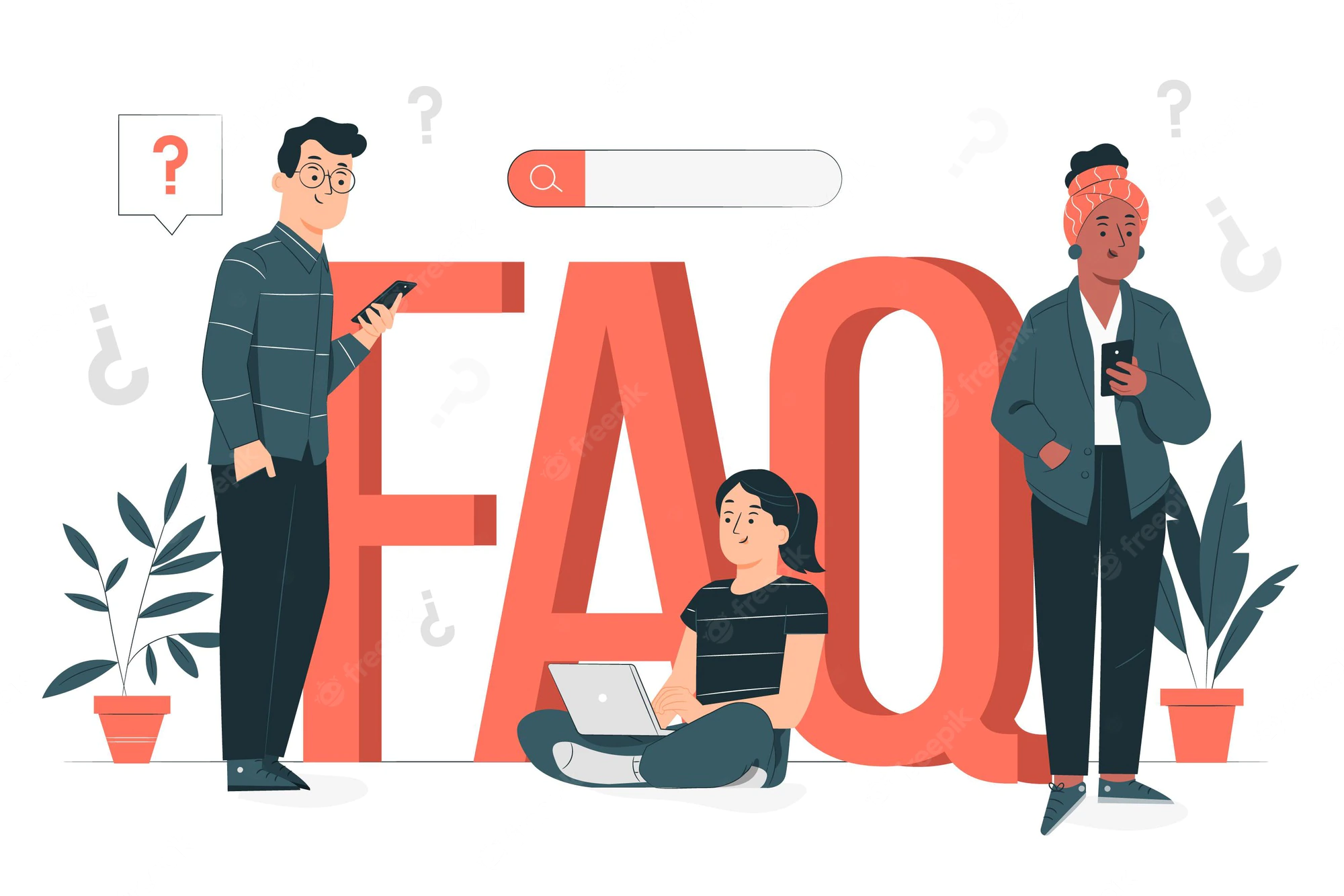
Put that information somewhere apparent and simple to discover on the mobile homepage by considering what details your mobile visitors are most likely to be seeking when they visit your website. Think about the frequently asked questions website visitors ask the most. Having all the solutions prominently displayed on your mobile homepage may not make sense, but make sure they are simple to locate and browse.
5. Maintain a Simple Web Design
Complex websites with a lot of clutter are difficult to navigate on any screen, but they are particularly challenging for visitors using mobile devices
Try to keep things simple. A basic design will also aid in quicker load times because there are fewer files on each page that need to be downloaded.

6. Choose Color Carefully
Choosing the colors for your website carefully is an important task. You need a perfect balance between beauty and clarity to attract customers. Not only about your color palette need to make sense for your genre, but the shades between the background and text need to be visible enough that the visitor can read the text easily and not strain the eyes.

7. Make Use Of Big Font Sizes
It is more difficult to read on a small screen if the font is small. On your web pages, it’s advisable to use a font size of at least 14px, but feel free to experiment and see if greater might be preferable.
Using traditional fonts is also recommended. It’s not good on mobile when your website loads slowly because a visitor’s browser might need to download a font
8. Use less Flash
It’s bad for SEO to use flash all throughout your website. It can make a page take longer to load, and on many browsers and devices, it completely fails to function. Your website’s mobile customers will be excluded if it depends in any way on the experience of a flash animation because neither Android nor iOS smartphones support flash.
9. Be Sure To Use The Viewport Meta Tag
Controlling how your website appears on mobile devices is simple with the viewport meta tag. On the little screen of your phone, if your page opens at the same width as it does on your desktop, you will have to painfully scroll from side to side to read each line of text and see the various sides of the page. The viewport meta element instructs browsers to resize your website to fit the width of the screen of the device the visitor is using to access it.
10. Beef Up Your Contact Page
If you don’t have a straightforward way for consumers to contact you on your website, you risk losing the trust of some users who land on your page and they might be the loyal ones. About 51% of people state that they believe in providing complete contact information. This is something many websites are missing and should work on. If your contact is simply an email, consider beefing up this information and giving them what they require.

11. Provide a Method to Change to Desktop View
It’s possible that some of your mobile visitors would rather view your website on a desktop computer than on a mobile device (especially if you go with a mobile version of your website rather than a responsive site).
If they prefer to do that, provide a means of doing so. You need to allow users to interact with your website in a way that makes sense to them
Create a Mobile-Friendly Website
Even if everything is perfect today, tomorrow’s mobile-friendly website might not still function as it does today due to ongoing changes in how mobile devices look and operate. You should be alright if you keep testing, making adjustments as necessary, and prioritizing your mobile users.